ggplot2: info
ggplot2 uses the “Grammar of Graphics” and layers graphical components together to help us create a plot
Let’s start by making a simple plot of our data!
ggplot2: exercise
Get a full view of the dataset:
Or catch a glimpse:
Rows: 344
Columns: 8
$ species <fct> Adelie, Adelie, Adelie, Adelie, Adelie, Adelie, Adel…
$ island <fct> Torgersen, Torgersen, Torgersen, Torgersen, Torgerse…
$ bill_length_mm <dbl> 39.1, 39.5, 40.3, NA, 36.7, 39.3, 38.9, 39.2, 34.1, …
$ bill_depth_mm <dbl> 18.7, 17.4, 18.0, NA, 19.3, 20.6, 17.8, 19.6, 18.1, …
$ flipper_length_mm <int> 181, 186, 195, NA, 193, 190, 181, 195, 193, 190, 186…
$ body_mass_g <int> 3750, 3800, 3250, NA, 3450, 3650, 3625, 4675, 3475, …
$ sex <fct> male, female, female, NA, female, male, female, male…
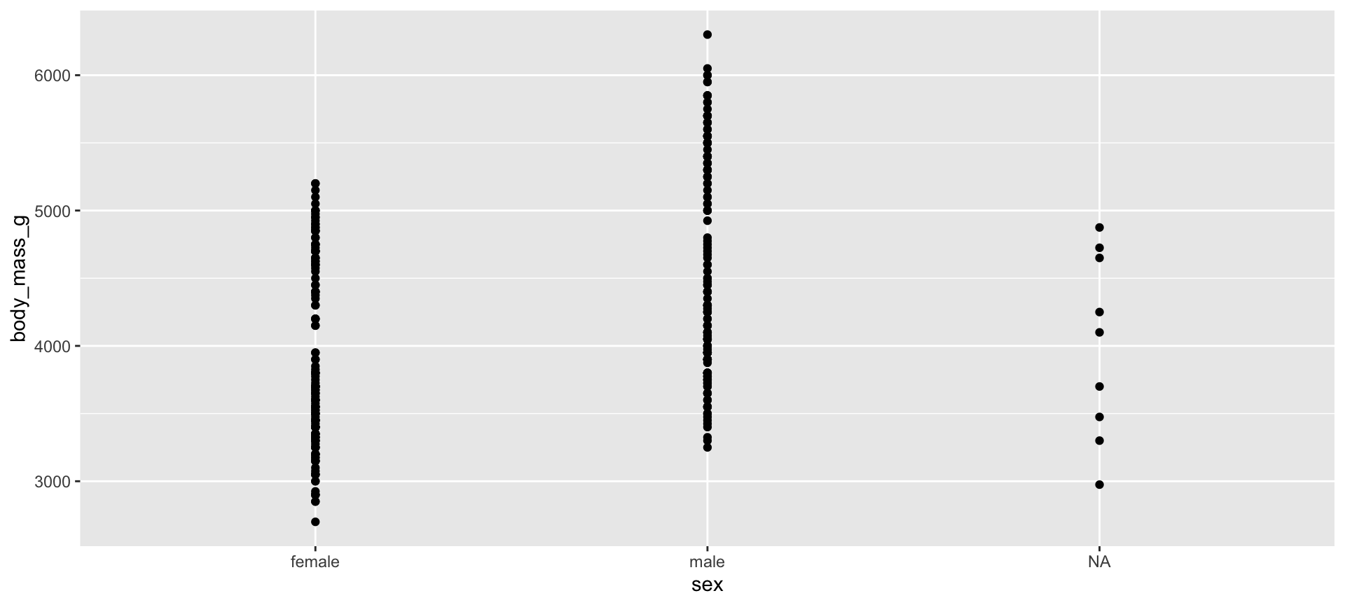
$ year <int> 2007, 2007, 2007, 2007, 2007, 2007, 2007, 2007, 2007…Let’s see if body mass varies by penguin sex using geom_point()
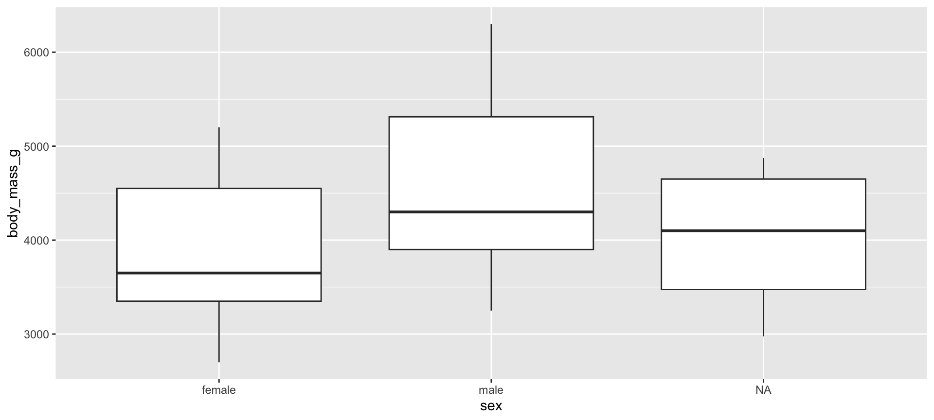
Let’s see if body mass varies by penguin sex, this time with geom_boxplot()
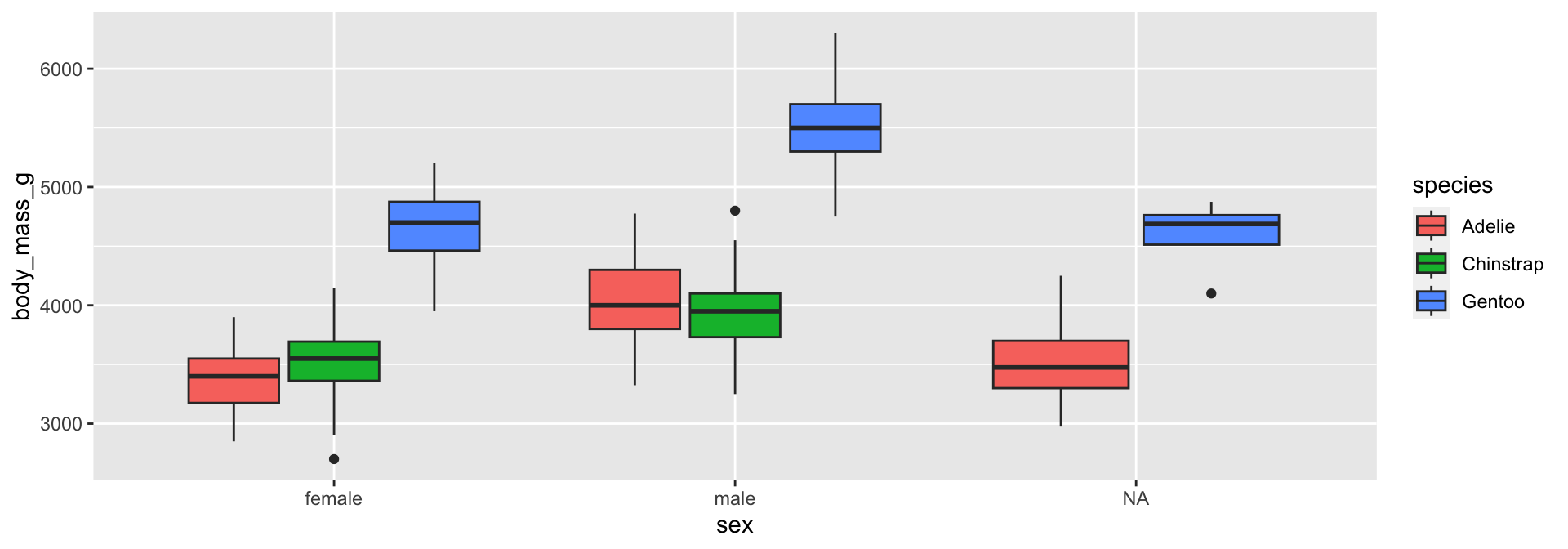
Let’s see if body mass varies by penguin sex, and now fill the boxplots
according to penguin species
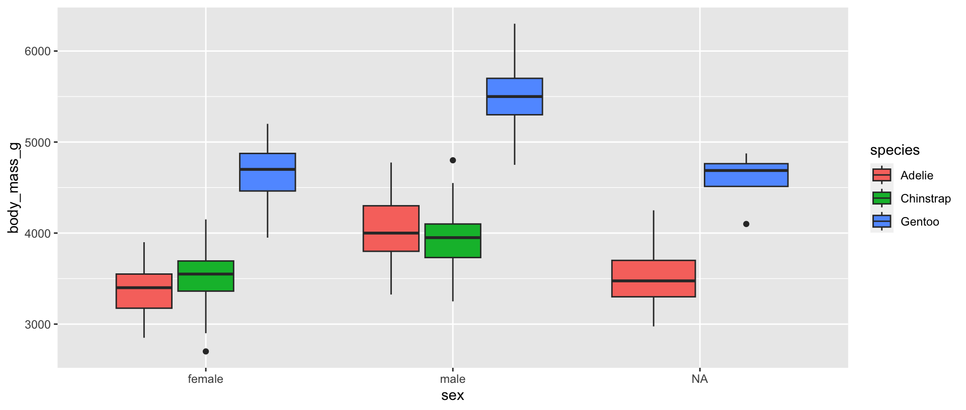
The boxplot filled by species helps us see…
- Gentoo penguins have higher body mass than Adélie and Chinstrap penguins
- Higher body mass among male Gentoo penguins compared to female penguins
- Pattern not as discernible when comparing Adélie and Chinstrap penguins
- No
NAs among Chinstrap penguin data points! sex was available for each observation